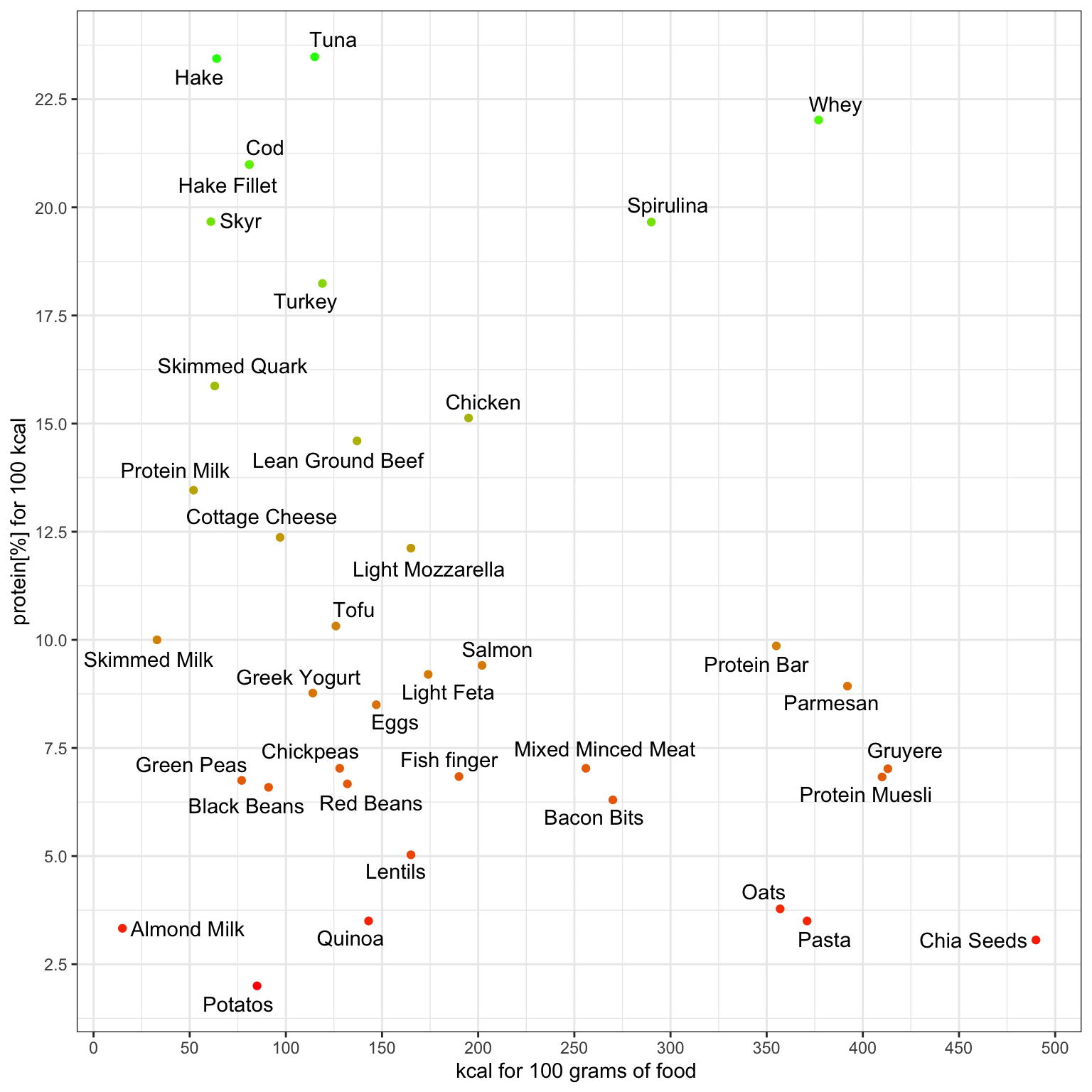
On the axis, as you move towards the right, the food becomes more calorie-dense. Similarly, moving upwards indicates increasing protein density.
Consequently:
* Top left indicates foods with high protein content per calorie and low calorie count per 100g.
* Bottom right represents foods with low protein content per calorie but high overall calorie count per 100g.
* Top right denotes foods with high protein content per calorie and high calorie count per 100g.
* Bottom left signifies foods with low protein content per calorie and low calorie count per 100g.
burgiebeer on
skimmed quark just throwing out fake foods to see if we’re paying attention
Any-Ninja-4174 on
May be a dumb question, but for easier comparability why wouldn’t you just do a bar chart of g protein per kcal?
DakotasBYGarden on
So thats why all the body builders eat canned tuna…yuck.
Electrical_Dinner773 on
Wouldn’t it make more sense to compare either 100g to 100g or 100kcal to 100 kcal. This makes it seem that may foods are better for protein intake than whey, and that’s just not true.
Bigfops on
Ok people, THIS is what beautiful data looks like. Well-considered axes, good spacing and useful information in a digestible format with color only used a secondary indicator. It’s not flashy, it’s not squiggly or “fun”, it’s a useful way to convey good information. It is the ideal graph. You may not like it, but this is what peak data looks like.
Username12764 on
Actually, it‘s Gruyère /s
trymypi on
What about sardines and mackerel, need to see those crucial tinned fishies
adave4allreasons on
Could you post the source of this information, please?
[deleted] on
[deleted]
Steveee-O on
This chart is not accurate. Almost every whey protein in existence is somewhere in the range of 25g of protein with 140-160 calories. Another one I noticed is an egg which is typically in the range of 7-8g protein per egg at around 70 calories each
The8thHammer on
i assume this is for whole animal when it comes to animal proteins seeing that chicken is so far down but chicken breast would be on top if it was listed as breast?
gimme_dem_keys on
This data is not beautiful lol what are these axes
PrometheusHasFallen on
I guess my viking diet of cod and skyrr is really paying off!
Puzzled_Draw6014 on
It seems a bit misleading because it’s protien per calorie, then calorie per weight… but maybe this is the standard way for the field of nutrition?
Calixare on
Hake point is impossible. Each gram of protein contains 4 calories, thus, 100 g of hake has at least 92 calories from 23 g of protein.
BetFlipper34 on
You should put in bone broth
Gathered22 on
i read turkey and was looking for germany, for straight 20 seconds…. then i realized
british-and-fittish on
u/andres_A please could do also do this for fibre vs calorie density? 🙏🏼
SilverSlong on
so tuna is the most protein healthiest dense option?
spageddy_lee on
This is pretty good. As someone who is a barbell and nutrition enthusiast that tries to eat as much from plants as I can, I would consider a few more for the protein to kcal ratio:
Pea protien ~ 23%
Gluten flour (seitan) ~ 18%
Texturized Vegetable Protien ~ 14%
TCpls on
If Tuna didn’t have mercury in it I’d live off of it
Put_Kam_Aina on
Where is the Bulgarian fillet Elena, which us 195 calories for 40g of protein
mimpf21 on
I get like 75% of my protein of Whey, Skyr and Magerquark.
NacogdochesTom on
The y axis (protein % for 100 kcal) is problematic. If it’s protein % by weight (as would be expected), then dividing by 100 kcal makes no sense. Is it supposed to be protein /100 kcal? That would make more sense except now you are plotting a quantity that is dependent on the x axis (kcal/100g).
Protein/100g vs. kcal/100g would make more sense.
Rhodog1234 on
What about finger-less fish?
TruTechilo512 on
Why do potatoes have to be so good 😭
Moloch90 on
Protein per calorie* Vs calorie density. Fixed it for you.
This doesn’t make sense to me, why not use protein per 100 g?
Wonderful-Loss827 on
Never eating fish fingers again!
BonCourageAmis on
Isn’t whey 93% protein and fat free?
KingHi123 on
Sorry if I’m being stupid, but why does it says protein% for 100kcal? Surely the percentage should remain constant no matter the amount, right?
slamdamnsplits on
“chicken” should probably be broken down to breast and thighs as they are quite different within the context of this chart.
Same with “eggs”. Whites vs whole vs yolk makes a big difference.
ProperBoots on
ya can’t be doin this to me axis ya fool. love the idea though
Thye204 on
Y axis seems to be the amount of protein in grams per 100 kcal in percentages. What kind of weird stat is that?
12kdaysinthefire on
Skyr is nasty af I’m sorry
Sufficient_Laugh on
Potatos… Did Dan Quayle draw this chart? He still can’t get it right.
EastboundClown on
Why does the chart contain bacon bits but not bacon?
Dampware on
Maybe this could be easier to understand with a 3d plot of protein vs kcal vs grams?
itsloque on
Skyr is about 10g protein per 100g
machingunwhhore on
So many of these plot points are wrong
Abradolf94 on
Interesting data but bad representation. Protein per calorie is already what you care about in this type of correlation so the X axis is sorta useless. Also the colour coding if I’m not mistaken is exactly the same as the y axes, which makes it so this plot as one colour and two axes for communicating only 1 thing
GryptpypeThynne on
r/dataisbeautiful strikes again…basic ass scatter plot, poorly chosen axes, barely even labeled properly, spelling mistakes

![[OC] Protein vs. Calorie Density: A Visual Guide](https://www.byteseu.com/wp-content/uploads/2024/04/2kryw1s5i9vc1-1024x1024.png "[OC] Protein vs. Calorie Density: A Visual Guide")
43 Comments
# # How to read this scatter plot
On the axis, as you move towards the right, the food becomes more calorie-dense. Similarly, moving upwards indicates increasing protein density.
Consequently:
* Top left indicates foods with high protein content per calorie and low calorie count per 100g.
* Bottom right represents foods with low protein content per calorie but high overall calorie count per 100g.
* Top right denotes foods with high protein content per calorie and high calorie count per 100g.
* Bottom left signifies foods with low protein content per calorie and low calorie count per 100g.
skimmed quark just throwing out fake foods to see if we’re paying attention
May be a dumb question, but for easier comparability why wouldn’t you just do a bar chart of g protein per kcal?
So thats why all the body builders eat canned tuna…yuck.
Wouldn’t it make more sense to compare either 100g to 100g or 100kcal to 100 kcal. This makes it seem that may foods are better for protein intake than whey, and that’s just not true.
Ok people, THIS is what beautiful data looks like. Well-considered axes, good spacing and useful information in a digestible format with color only used a secondary indicator. It’s not flashy, it’s not squiggly or “fun”, it’s a useful way to convey good information. It is the ideal graph. You may not like it, but this is what peak data looks like.
Actually, it‘s Gruyère /s
What about sardines and mackerel, need to see those crucial tinned fishies
Could you post the source of this information, please?
[deleted]
This chart is not accurate. Almost every whey protein in existence is somewhere in the range of 25g of protein with 140-160 calories. Another one I noticed is an egg which is typically in the range of 7-8g protein per egg at around 70 calories each
i assume this is for whole animal when it comes to animal proteins seeing that chicken is so far down but chicken breast would be on top if it was listed as breast?
This data is not beautiful lol what are these axes
I guess my viking diet of cod and skyrr is really paying off!
It seems a bit misleading because it’s protien per calorie, then calorie per weight… but maybe this is the standard way for the field of nutrition?
Hake point is impossible. Each gram of protein contains 4 calories, thus, 100 g of hake has at least 92 calories from 23 g of protein.
You should put in bone broth
i read turkey and was looking for germany, for straight 20 seconds…. then i realized
u/andres_A please could do also do this for fibre vs calorie density? 🙏🏼
so tuna is the most protein healthiest dense option?
This is pretty good. As someone who is a barbell and nutrition enthusiast that tries to eat as much from plants as I can, I would consider a few more for the protein to kcal ratio:
Pea protien ~ 23%
Gluten flour (seitan) ~ 18%
Texturized Vegetable Protien ~ 14%
If Tuna didn’t have mercury in it I’d live off of it
Where is the Bulgarian fillet Elena, which us 195 calories for 40g of protein
I get like 75% of my protein of Whey, Skyr and Magerquark.
The y axis (protein % for 100 kcal) is problematic. If it’s protein % by weight (as would be expected), then dividing by 100 kcal makes no sense. Is it supposed to be protein /100 kcal? That would make more sense except now you are plotting a quantity that is dependent on the x axis (kcal/100g).
Protein/100g vs. kcal/100g would make more sense.
What about finger-less fish?
Why do potatoes have to be so good 😭
Protein per calorie* Vs calorie density. Fixed it for you.
This doesn’t make sense to me, why not use protein per 100 g?
Never eating fish fingers again!
Isn’t whey 93% protein and fat free?
Sorry if I’m being stupid, but why does it says protein% for 100kcal? Surely the percentage should remain constant no matter the amount, right?
“chicken” should probably be broken down to breast and thighs as they are quite different within the context of this chart.
Same with “eggs”. Whites vs whole vs yolk makes a big difference.
ya can’t be doin this to me axis ya fool. love the idea though
Y axis seems to be the amount of protein in grams per 100 kcal in percentages. What kind of weird stat is that?
Skyr is nasty af I’m sorry
Potatos… Did Dan Quayle draw this chart? He still can’t get it right.
Why does the chart contain bacon bits but not bacon?
Maybe this could be easier to understand with a 3d plot of protein vs kcal vs grams?
Skyr is about 10g protein per 100g
So many of these plot points are wrong
Interesting data but bad representation. Protein per calorie is already what you care about in this type of correlation so the X axis is sorta useless. Also the colour coding if I’m not mistaken is exactly the same as the y axes, which makes it so this plot as one colour and two axes for communicating only 1 thing
r/dataisbeautiful strikes again…basic ass scatter plot, poorly chosen axes, barely even labeled properly, spelling mistakes
Tofu way better than expected
However, is this beautiful data? I’m not so sure…